 English
 Русский
 Español
 Português
 Deutsch
 Français
 Indonesia
 Tiếng Việt
 中文
 العربية
 اردو
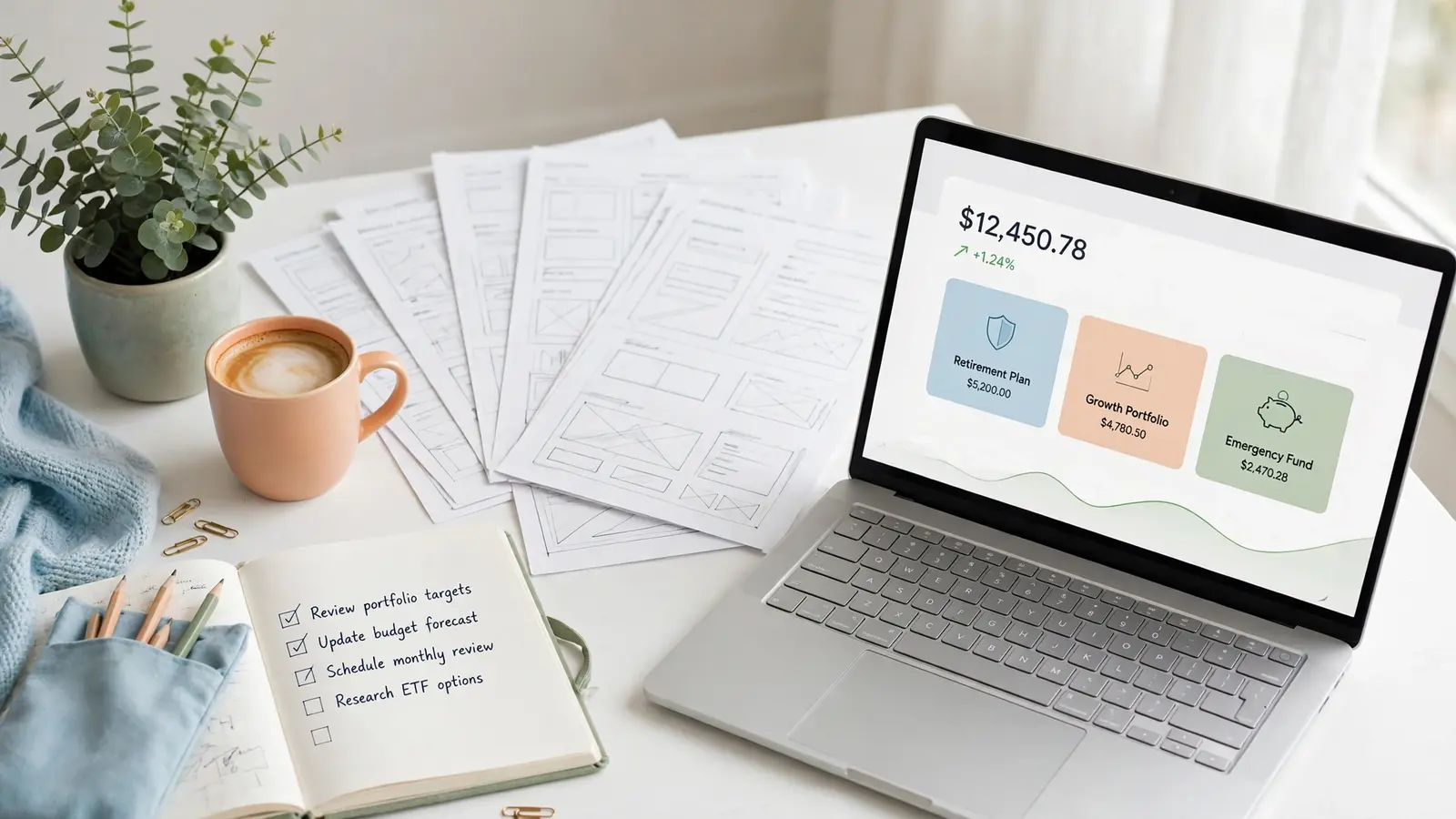
Professional investment website design is not decoration added at the end. It is the whole platform, designed as one thing: a plain homepage offer, readable plan cards, a dashboard led by the balance, and deposit and withdrawal screens that feel careful with money. A visitor decides in about five seconds whether the site looks serious — and that decision is made by the design, before a single plan term is read.
What investment website design actually covers
A template is the design layer of a GoldCoders website: home page, sign-up and login, member dashboard, deposit and withdrawal, security and account pages, and the FAQ. It does not include the script underneath — the GoldCoders HYIP Manager script, bought separately from GoldCoders, runs members, plans, deposits and payouts. The design only decides how all of that looks and how easy it is to use.
A buyer who judges a template by its homepage alone is judging about a tenth of the product. Members live inside the member area, where the money moves: checking a balance, reading a plan, making a deposit, asking for a withdrawal. A design that is beautiful on the landing page and careless inside fails exactly where it matters most.
The homepage: five seconds to look serious
The homepage has one job in the first five seconds: tell the visitor what the platform offers and make them believe it is real. The strongest homepages do it with a short headline, one clear sentence about the plans, and the plan cards themselves — not a wall of adjectives.
Four things decide it. First, the plan offer is visible without scrolling: plan names, return figures and deposit ranges, in cards a reader can scan. Second, the payment methods appear as one consistent set of icons — the same set that appears again on the deposit page. Third, nothing pops up, counts down or flashes: calm layout reads as confidence, clutter as pressure. Fourth, the page is clean on a phone, with no sideways scrolling and no text running off the edge.
Plan cards: the part members read first
Plan cards are the most-read element on any investment website. A good one shows four things at a glance: the plan name, the deposit range, the return figure, and the term. Everything else sits below, smaller, and never competes with those four.
The mistakes we see most often are readability mistakes. Return figures set so small that a phone reader has to pinch-zoom. Three plans squeezed into one row so tightly that the ranges blur together. A card design that looks fine with two plans and falls apart when the owner adds a third. Our rule: design the card for the largest number of plans the owner might run, not the number on the screenshot, and test it with real figures. One accent colour per card is enough — four bright colours at once is noise, and noise makes a visitor slower to trust the numbers.
The dashboard is where members live
In every member area we build, the balance is the biggest figure on the screen, with deposits, earnings and withdrawals readable beside it. The balance is the one number a member checks every visit, and a dashboard that hides it behind decoration wastes the member’s time.
Around the balance, every menu item is labelled with a working icon — Dashboard, Deposit, Withdraw, History, Referrals, Security, Settings. Deposit and withdraw are one tap from the dashboard itself. The layout stays full-width and balanced on desktop, and stacks into full-width panels on a phone.
We check every dashboard on a real phone before a pack ships: members check balances on phones, and a dashboard that breaks on a phone is the most common design failure in this niche.
Deposit and withdrawal screens decide trust
No screen carries more trust than the deposit screen, and none is judged more harshly than the withdrawal screen. The rules are simple: the amount and the wallet address must be fully visible, never clipped, and both must have a copy button that works. A member who cannot see the full amount, or must retype a long wallet address by hand, stops trusting the screen — and the platform behind it.
The deposit page should also say, in plain words, what happens next: the payment is confirmed, the balance is credited, and the member can watch the status change. The withdrawal page should show the available balance, the requested amount, and the status of past requests, each labelled clearly. Hiding any of this behind a small grey link costs trust every day.
Before calling a design finished, we run one small real deposit and withdrawal through every gateway on our rigs.
Colour, type and spacing: the quiet signals
Visitors rarely comment on a website’s colours or fonts, which is why those choices matter — they are judged without being noticed. A professional investment website uses two or three colours at most: one dark tone for text and structure, one main brand colour, and one accent for actions and highlights. A site that introduces a fresh colour on every section looks assembled from spare parts.
Typography follows the same discipline. One type family for headings and one for body text is plenty; bold is reserved for titles and the large figures that matter, such as the balance. Plan terms, fees and limits are set at a size a phone reader can read — small grey footnotes are where trust quietly dies. And generous spacing between sections and cards is what lets the important parts breathe: cramped pages, where cards touch and text crowds the edges, feel rushed even when the words are right.
Judging a design from its screenshots
Our templates are shown only through full screenshot galleries — there is no click-through preview to open on the web. A gallery that shows only the homepage is a warning sign. A gallery worth trusting shows the home page, sign-up, FAQ, dashboard, deposit, withdrawal, edit account and security pages.
Judge the gallery the way a member will judge the site. Read a plan card on the dashboard screenshot. Check that the payment icons match between the homepage and the deposit page. Look at the mobile views: does the dashboard stack cleanly? If a pack’s gallery cannot answer these questions, the design has not been shown to you yet, only advertised.
Our guide to choosing a template and our features guide are the checklist we use on every pack we build.
What good design costs
A ready-made template from our shop is $75, covering the complete design pack: every screen above, the themed payment-method icons, and the responsive layout. Our guide to what is included in a template pack lists every part.
To match your brand — colours, logo, fonts, homepage sections restyled — customisation is $15 or $25 by scope. A design made only for you is priced by tier on the services page, with timelines of 5, 7–10 and 10–14 days. Script installation and setup is $15 or $25, plans setup $10, $20 or $35, and gateway integration $20. The complete website service — script installed, one premium template, plans, payments and settings done — is $200, $500 or $1,000 by tier. The script licence itself is always your own purchase from GoldCoders, on every tier.
Frequently asked questions
Does the design change how the script works?
No. The design is only look and layout. The GoldCoders script underneath runs members, plans, deposits, earnings and payouts exactly as it always does. A template changes what the member sees, never what the platform does.
Can I change the colours and logo after buying a template?
Yes. Colours, logo and favicon, fonts and homepage sections are the most common customisation requests, at $15 or $25 for the listed scopes. Deeper changes are quoted exactly before work starts. See our guide to customising a template to your brand.
How do I know a design is good before I buy it?
Judge the full screenshot gallery, not the homepage alone: dashboard, deposit, withdrawal, security and mobile views, with readable plan cards and matching payment icons. Our trust and design mistakes guide lists the faults that cost a platform its visitors.
Is a custom design worth it over a ready-made template?
It is worth it when you need a look nobody else has, or a layout a ready-made pack does not offer. For most launches, a $75 template with a $15 or $25 customisation for brand colours and logo gives you a professional result in days instead of weeks.
Good investment website design is invisible when it works: the visitor understands the offer, the member finds the balance, the deposit goes through, and nothing on the page asks to be noticed.