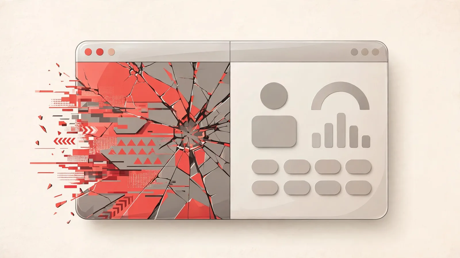
Visitors cannot audit your code or your reserves. What they can do — instantly — is judge how your platform looks. These are the five design mistakes we see most often, and every one of them is avoidable.
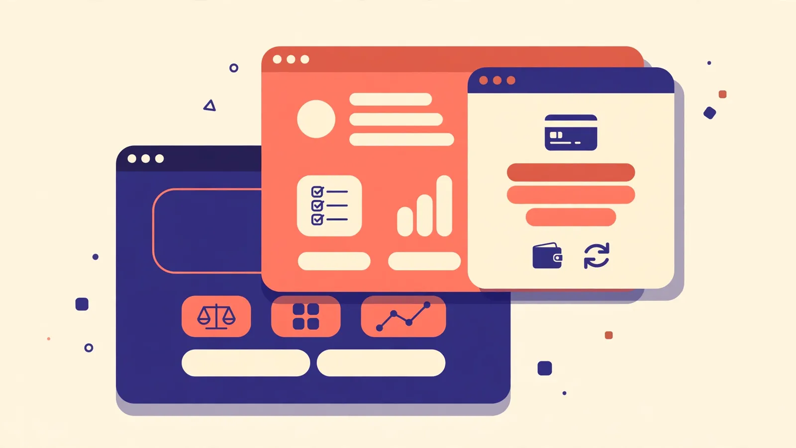
1. A homepage that promises, a member area that disappoints
When the inside of the platform looks cheaper than the outside, members assume the whole operation is a façade. The member area is where trust is kept or lost.
2. Broken or mismatched payment icons
Different icon styles, missing coins, stretched logos — the deposit page is the worst possible place for sloppiness, because that is the exact moment a member decides whether to send money.
3. Text nobody can read
Light grey text on white, tiny fonts, glowing numbers everywhere. If a member has to squint to read your plan terms, they will read a competitor's instead.
4. A mobile site that is an afterthought
Menus that hide the login button, tables that slide off the screen, deposit forms that need pinch-zooming. Most of your traffic is mobile; a broken mobile view tells most of your audience to leave.
5. Clutter that shouts desperation
Five popups, three countdown timers, banners in every gap. Serious platforms are calm. Space, consistency and restraint read as confidence — noise reads as a project that needs money fast.
The good news: none of this requires a big budget. It requires a template built with discipline — which is exactly what we check before any pack is listed in our shop.