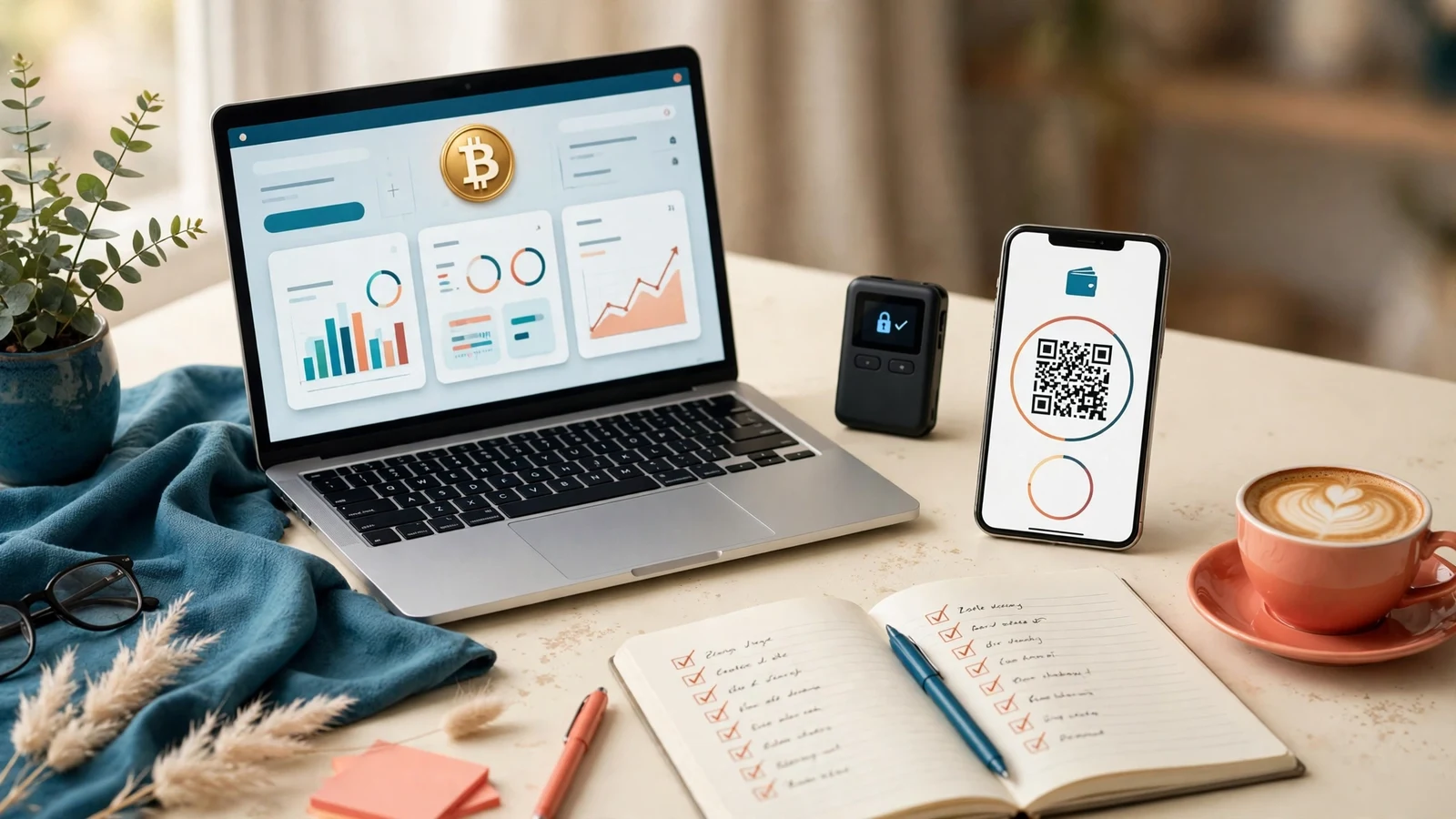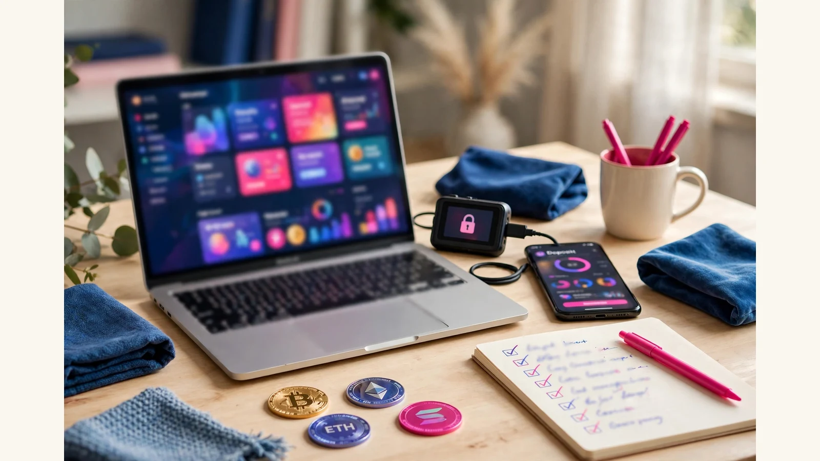
If you are choosing a forex trading website template, here is the short answer: pick the template whose dashboard, plan cards and money pages read clearly on a phone, not the one with the flashiest chart on its homepage. Members spend their first week inside the member area, checking balances, reading plan terms and making deposits and withdrawals. A homepage chart never compensates for a dashboard that hides the balance or a plan card that hides the minimum.
That is the test we use at HyipTemplates, where we install templates, set up plans and gateways, and repair half-finished sites. The forex designs that cause trouble are rarely the plain ones: they are the dramatic ones where the chart looks like live trading, or the plan card promises more than the terms say.
What "forex-ready" really means
A forex trading website template, in our shop, is a design pack for the GoldCoders HYIP Manager script. It changes how the site looks: home page, member dashboard, deposit, withdraw and all inner screens, themed payment-method icons and a responsive layout. It does not include the script or change what it does. One purchase covers one live site.
That distinction matters most for a forex theme, because a forex look invites a misunderstanding. A template is not a trading terminal: it does not execute trades, connect to a broker, or stream live prices. It presents your plans, terms and member area in a forex style. Real trading functionality is a different product.
So "forex-ready" is a design question: does this design present plan terms, balances and payments clearly, in a forex style? Judge it on the member area first, and open the full page gallery before you buy. If a gallery only shows the homepage, treat that as a warning.
Charts and market visuals: honest, not theatrical
Every forex template leans on charts, and charts are where a design can quietly mislead. A rising candlestick graphic is decoration, and members mostly understand that. The problem starts when decoration is dressed up as evidence: a chart labelled with live prices that are not live, or a profit curve presented as a track record.
Check the screenshots with that in mind:
- Is the chart clearly a design element, or pretending to be data? A stylised chart behind a headline is fine. A chart with precise prices and a profit line, presented without explanation, is a claim your site will have to defend.
- Do the numbers match the plan terms? If a plan card says one daily rate and a chart beside it implies another, members will notice, and the gap will cost you trust.
A calm, honest design keeps members longer than a dramatic one that overpromises. Our guide to choosing a template makes the same point: presentation is the first audit a visitor performs.
Plan cards that survive forex-style plans
Forex-styled plans usually combine a daily percentage, a term in days, a minimum and maximum deposit, and sometimes compounding. One card must carry all four numbers plus their plain-English meaning, which is easy to design badly.
Test the plan cards in the gallery against your real numbers, not the sample ones:
- Can you read the rate, the term and the minimum in one glance?
- Do three, four or six plans still look orderly, or collapse into a wall of similar cards?
- Is compounding explained in plain words, or hidden behind a term a new member will not know?
- Does the card still work when a plan is added or removed later?
Plans, rates, terms, limits, compounding and referral levels are settings in the GoldCoders admin, not part of the design. The template simply displays whatever you set. Our Investment Plans Setup service, at $10, $20 or $35, sets those plans up correctly, but it cannot rescue a plan card never designed for your structure.
If your plans pay a fixed daily rate, say so in plain words. Do not let a chart imply the return follows the market when it does not.
The dashboard is where forex members live
A forex-branded member opens the dashboard far more often than the homepage, to answer three questions: what is my balance, what have I earned, and what is happening with my deposits and withdrawals? A dashboard that answers those three in the first screen is doing its job. One that buries them under banners and tickers is not.
Look for these things in the dashboard screenshots:
- The balance, centre-stage and readable at a glance. Not small, not below three banners.
- Earnings and active deposits in the same view. A member should not need three clicks to connect a deposit to its earnings.
- Every menu item labelled, with a working icon. An unlabelled icon is a support ticket waiting to happen.
- Deposit and withdrawal history in plain language. Dates, amounts and statuses without a glossary.
Because forex members expect a trading-style interface, a clean dashboard reassures them more than a busy one.
Deposit, withdrawal and the currency question
The money pages deserve the same strict check as any other site. A deposit page should show one clear address per payment, with the network named next to it where stablecoins are involved, a copy button that clearly works on a phone, and the minimum shown before the member sends anything. The withdrawal page should make a wrong address hard to enter, show the minimum and any fee before confirmation, and show withdrawal history in the same place.
The forex-specific question is simpler: does the design’s currency presentation match what you actually accept? Check that the themed payment icons cover your coins or methods, stay distinct at phone size, and are consistent everywhere money moves. Our crypto payment gateways guide explains the gateway side: the address, the confirmation watch, and the callback that credits the member.
Test the phone view before buying: deposit addresses and withdrawal forms are the widest elements on a small screen, and a page needing sideways scrolling will cost you members.
A shortlist method that works
Do not compare twenty templates. Compare three, properly: shortlist three whose style fits your brand, open the same five pages on each (dashboard, deposit, withdraw, plan list and FAQ), and score them on five questions: balance obvious, plan terms plain, minimum visible, no sideways scrolling on a phone, and charts that decorate rather than pretend to be data. The template that answers yes five times is your template.
If none passes, shortlist three more, or go custom: Template Customisation from $15 or $25 reshapes an existing design around your brand, and a fully custom template design from $150, $350 or $500 gives you a design nobody else has.
What it costs to go from template to a live site
A template is only one part of the budget. A premium template in our shop is $75. GC Script Installation and Setup is $15 or $25, the higher tier adding full settings, email testing, gateway basics and a launch-checklist walkthrough. Payment Gateway Integration is $20 for one gateway integrated and tested end to end. Investment Plans Setup is $10, $20 or $35. A complete website takes 5-7 days at $200, 7-10 days at $500, or 10-14 days at $1,000, and includes one premium template.
The script licence is bought from GoldCoders, never included in a template pack; hosting is paid to your provider. One discipline no template can provide: a small real deposit and withdrawal through every gateway, before you announce. Our launch checklist guide covers the full list.
The forex shortlist, on one screen
| Check | Pass | Fail |
|---|---|---|
| Market visuals | Charts presented as design and illustration | A fake “live” chart implying trading or returns |
| Plan cards | Rates, terms and minimums readable at a glance, sized for your real plan count | Cards that only work with the screenshot’s plans |
| Dashboard | Balance first, deposits and withdrawals one clear step each | A trading-terminal costume over a confusing member area |
| Currency display | Amounts, networks and wallet details named exactly, everywhere money moves | Mixed symbols, unnamed networks, amounts that change format between pages |
| Phone view | Member screens usable one-handed, no sideways scrolling | Only the homepage was adapted |
Run any forex trading website template through those five lines in its gallery — ours included — and the shortlist usually makes itself. Style is the invitation; the member area is the product.
Frequently asked questions
Does a forex trading website template trade forex for me?
No. A template is only the design layer for the GoldCoders script. It does not execute trades, connect to a broker, or stream live prices. It presents your plans and member area in a forex style.
Should my homepage chart show live market prices?
Only if those prices are genuinely live, sourced, and explained. A decorative chart is fine as decoration. A chart presented as live data or a profit record, when it is neither, will mislead members. When in doubt, keep the chart stylised and your plan terms in plain words beside it.
How many plans should a forex-styled site run?
As many as your terms genuinely support, and no more. Judge the template on your real plan count: three, four or six plans must all stay readable.
What should I test before announcing a forex-styled site?
Run a small real deposit and withdrawal through every gateway you will offer, check the dashboard and plan cards on a phone, and confirm the balance updates as a member would see it. If a payment path has not been tested with a real transaction, it has not been tested.