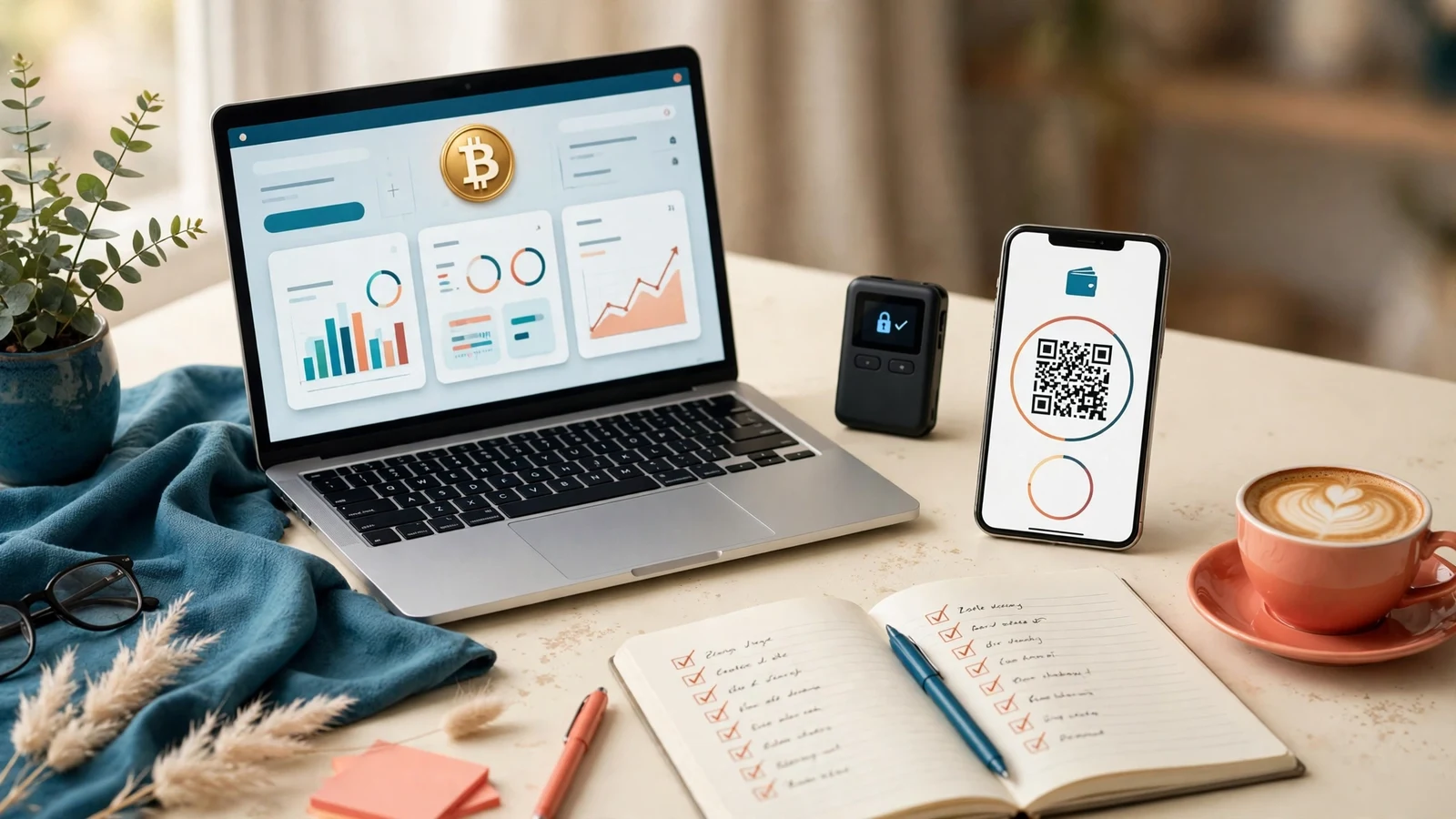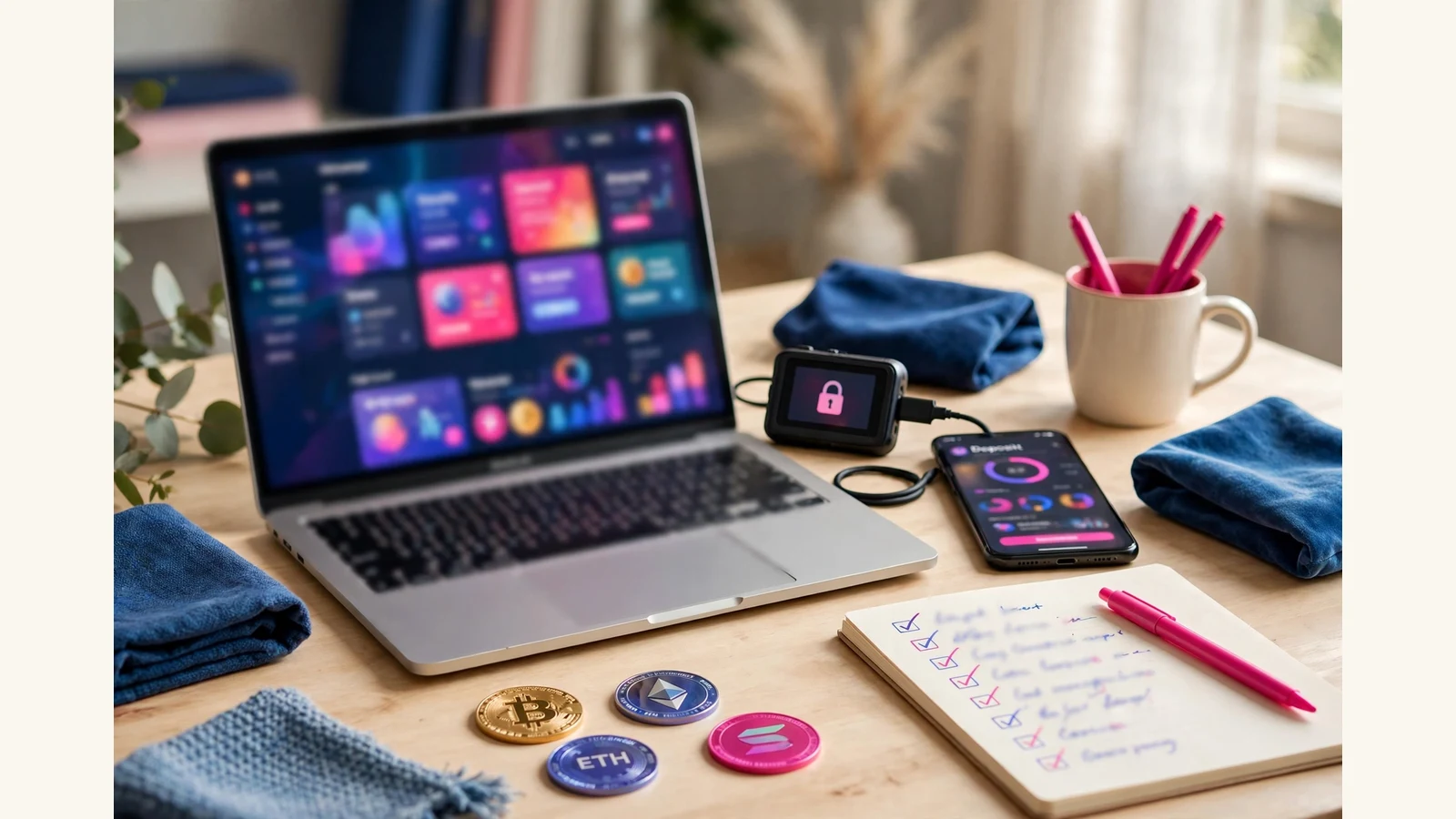
A crypto investment website template must handle real money moving in both directions, clearly, on every screen. That is the whole test. A pretty homepage means nothing if the deposit page confuses a first-time member or the plan cards hide the terms. Judge a crypto investment website template by its money screens first, and its homepage last.
The short answer: five things it must handle
A good template handles five jobs, all visible in the screenshots: Coin payments, shown consistently, with one matching icon set on the homepage, deposit page and withdraw page alike. A deposit flow a stranger can follow: pick a coin, see the address, copy it, and know what happens next. A withdraw flow stating the terms plainly, in words matching the plan terms. Plan cards telling the truth at a glance: rate, range, term and principal treatment. And security pages designed with the same care as the homepage, because members judge trust there.
If any one of the five is weak in the gallery, the template is weak, however good the homepage looks.
Coin payment tiles: the first thing to inspect
Crypto members do not deposit through a generic checkout: they pick a coin, and the design must make that choice obvious and safe. On a good template, the coin payment tiles are a proper set: one style, one size family, one icon language, used everywhere the same coin appears. Our guide to crypto payment gateways explains the gateway side; here the point is purely visual.
Open the deposit screenshot first, not the homepage. Each coin needs its own tile, clearly labelled, not a text-only dropdown where one wrong click sends the wrong coin. Our own store checkout carries a complete set, BTC, LTC, ETH, DOGE, TRX, BNB and USDT on TRC20, ERC20 and BEP20, and a template for this niche should treat its own coin list with the same completeness. The tiles must also match the homepage strip.
The worst fault in weak galleries is a tile with no clear selected state. The selected coin, its name and its network must all be visible before any amount is typed: USDT on the wrong network is the classic expensive mistake. On the phone view, tiles must stack cleanly, with names readable and tap targets big enough for a thumb, because most members deposit from a phone.

Deposit and withdraw flows: follow the money
A deposit flow has four steps, and a good template shows all four: the member picks a plan or enters an amount, picks a coin from the tiles above, sees the deposit address with a copy button, and then sees a plain confirmation state, waiting for payment, with the plan and amount repeated back.
The copy button deserves its own mention because we have seen templates without it. A wallet address is a long string no human should ever type out, so an address shown with no copy control beside it is a design fault, not a small omission. The debit amount must likewise be shown in full, never clipped mid-number.
The withdraw flow is the mirror image, and it is where trust is won or lost. A good withdraw screen asks for the amount and the wallet, states the terms in the same words as the plan cards, and confirms before anything moves. It never asks for a free-text comment field that has nothing to do with the payout, and after submission the member should see a clear status, not a blank page. When we test a launch ourselves, the small real deposit and withdrawal through every payment method is the step we never skip.
Plan cards: the terms must survive a glance
Plan cards are the most photographed part of any template and the most misread. A good card shows, in this order of prominence: the plan name, the rate, the deposit range, the term, and whether the principal is included in payouts. Anything less forces the member to hunt for the terms, which is how misunderstandings start.
Two details separate honest cards from decorative ones. First, the rate must be readable without squinting, with no trailing zeros after the decimal point that add nothing. Second, the card must stay clear when the plan count changes: count your own plans before you buy, then look at the gallery cards at that count. A design clean with three plans that collapses into clutter with six is not one you can grow into. Beware the card showing only a headline rate and hiding the range and term in small text. On our own packs, the deposit page mirrors the homepage cards, so a member sees the same terms in both places.
Security pages: where members decide whether to trust you
Security pages rarely make the marketing screenshots, which is why you should ask for them. A crypto investment website template must include designed security screens: edit account, change password, and a security settings page, all in the theme, all reachable from the member menu. A gallery that stops at the dashboard asks you to buy blind on the screens members use when something feels wrong.
Look for a password change form with a show and hide control on the password fields, so members can check what they typed, and labels outside the fields rather than vanishing placeholder text. Look for an edit-account page that keeps wallet settings in account settings, never on the sign-up form, and a security page matching the dashboard: same spacing, same button style, same care.
How to judge one from its screenshots
You cannot open a template before you buy it, but a full screenshot gallery is almost as good, read in the right order:
- Dashboard. Balance centre-stage, every menu item labelled with a working icon, page complete rather than half-empty?
- Deposit. Coin tiles, copy button, full amount, clear next step, phone view clean?
- Withdraw. Amount, wallet, plain terms, clear status after submit?
- Plan cards. Rate, range, term, principal treatment, all readable at your own plan count?
- Sign up and FAQ. Clean sign-up form, no payment or wallet fields where they do not belong, FAQ reading like real answers?
- Edit account and security. Designed, reachable, password fields with a show and hide control?
- Homepage, last. Does it honestly reflect the money screens?
That order is deliberate: sellers photograph homepages first because homepages flatter, but members live in the money pages.
Two red flags end the inspection immediately. First, any claim that you can click through a working copy of the template on the web: templates are shown through full screenshot galleries, not a browsable copy. Second, phone screenshots that are just shrunken desktop shots: open the phone view at phone width and check for sideways scrolling, squeezed wallet rows and clipped buttons.
What a template is not, and what it costs
A template is the design layer only. It does not include the script that runs members, plans, deposits and payouts: that licensed software is bought from GoldCoders, its maker, and the template sits on a clean install of it. One purchase covers one live platform, and delivery is automatic into downloads once payment confirms.
The honest costs, from our own live shop and services pages, are these: a template costs $75. Installation runs $15 for Basic, one day, or $25 for Standard, one to two days with full settings, tested email and gateway basics. Plans setup costs $10, $20 or $35 by tier, gateway integration costs $20, customisation costs $15 or $25 by scope, and security hardening costs $25. A complete website costs $200, $500 or $1,000 by tier, taking five to seven, seven to ten, or ten to fourteen days, and includes one premium template. Domain and hosting setup costs $20, $50 or $100 by tier. The script licence and hosting renewals belong to their providers and are priced by them, not estimated here. Browse the shop for templates, and read our launch checklist before you announce anything.
FAQ
What must a crypto investment website template include?
Coin payment tiles with one consistent icon set, a deposit flow with a copyable address, a withdraw flow with plain terms, plan cards showing rate, range, term and principal treatment, and designed security pages.
How do I judge a template from screenshots alone?
Read the gallery in money order: dashboard, deposit, withdraw, plan cards, sign up and FAQ, edit account and security, homepage last, checking the phone view for each money page.
Does the template include the script that runs the website?
No. The template is the design layer for the GoldCoders script, licensed separately from GoldCoders. You need both: the script to run the platform, and the template to design it.
Can I change the plans and rates after buying?
Yes. Plans, rates, terms, limits and referral levels are settings in the script admin, not part of the design. Set them deliberately before launch.
Judge the money screens first, the plan cards second, and the homepage last, and buy the template whose screenshots survive that order.