 English
 Русский
 Español
 Português
 Deutsch
 Français
 Indonesia
 Tiếng Việt
 中文
 العربية
 اردو
Investment website examples are the fastest way to learn what a good investment website looks like, because the good ones all solve the same five problems in the same order: a homepage that says what the site is in one screen, plan cards a member can read in ten seconds, a dashboard that shows the money clearly, deposit and withdrawal screens that feel safe, and small pages that answer questions before they are asked.
We look at examples every week in the shop. Every template pack is judged from its full screenshot gallery — home, dashboard, deposit, withdrawal, sign up, FAQ — before it is listed.
1. What an example is worth studying — and what is not
Not every example on the internet is worth your time. A homepage screenshot is not an example of a website. It is an example of a poster. A real example shows the whole member journey: the page a stranger sees, the page a member sees after signing up, and the two screens where money moves.
The examples worth studying are the ones you can click through, screen by screen. In our shop that means the full screenshot gallery of a template pack: the same design on the home page, the member dashboard, the deposit screen, the withdrawal screen and the phone layout.
2. The homepage test: one screen, three answers
Open any good example and ask three questions of the first screen. What is this site? What can I earn, and on what terms? What do I do next? The best examples answer all three before you scroll: the headline says it is an investment website, the plan cards show real numbers — a percentage, a term, a minimum deposit — and one clear button says where to go.
Watch what the good examples do not do. They do not fill the first screen with a stock photo and a paragraph about trust, hide the plans three scrolls down, or offer five buttons that all lead somewhere else. One job, one button, one set of numbers. The rest of the homepage is proof: payment methods, security notes, latest deposits and payouts, the FAQ link — found in one more scroll, not buried in a footer.
3. Plan cards: the part members read first
Every good example treats the plan cards as the heart of the site, because that is what they are. A member does not join a homepage. A member joins a plan. So study the plan cards before anything else, and ask what a member will ask: how much per day, for how many days, on what minimum, and what comes back at the end?
The best examples make those four numbers readable in ten seconds. The percentage is the biggest number on the card. The term and the minimum sit right underneath it, in the same size. The total return is stated plainly, in the same currency. And the cards run from the smallest plan to the largest. Hiding the minimum until the deposit screen is a trap members spot in one visit.

4. The dashboard is where members live
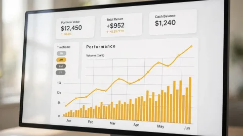
A homepage gets a thirty-second visit. A dashboard gets visited every day a member is active. Open a good dashboard and the first thing you see is the member’s own money: the balance, the amount working in plans, the total earned and the total withdrawn. Four numbers, large, in one row. Below them the active plans, and below that the latest deposits and withdrawals, with dates.
The bad examples fail in the same two ways: charts everywhere and the balance in small grey text, or every number the script knows crammed onto one page. Hand the example to someone who has never seen it and ask them to find the balance and the withdrawal button. In a good example that takes five seconds. Most members check a dashboard on a phone, so a good example stacks the four numbers into two rows of two and never asks for sideways scrolling.
5. Deposit and withdrawal screens decide trust
No screen decides trust faster than the deposit screen. A good one does three things in order: it shows the payment methods as recognisable tiles — Bitcoin, Litecoin, Ethereum, and the rest — so the member picks by sight; it shows the plan the deposit goes into and the minimum for that plan; then it shows the address with a copy button that works, and a plain sentence saying what happens next.
A good withdrawal screen is even simpler: the available balance first, then the amount and the wallet address, and nothing else — plus plain words on how long it takes and whether there is a minimum. Examples that hide the minimum until after the member has typed an amount generate the most support tickets.
6. The small pages that separate good from average
The difference between a good example and an average one lives on the pages nobody photographs: the FAQ, the security page, the referral page and the promo page. A good FAQ answers the questions that actually come up: how deposits work, how long withdrawals take, what happens if a plan ends, how the referral link works. A good security page says what is protected, in plain words.
A good referral page shows the member’s own link, the levels, and the commissions earned so far. None of these pages sells anything on its own. Together they tell a careful visitor the site was built for the member, not only for the sale.
7. How to study examples without copying anything
Studying examples is not copying them. Study the structure, not the surface. Note where the plan cards sit, how many numbers the dashboard shows, what the deposit screen asks for and in what order. Ignore the exact colours, wording and pictures — those belong to the example. The structure belongs to good practice.
Our shop method takes about half an hour. Open three full screenshot galleries — three different template packs — and write down, for each one, the answers to five questions: what does the first screen say, how fast can you read a plan card, where is the balance on the dashboard, what does the deposit screen ask for, and what do the small pages cover. The answers that appear in all three are the pattern. Copy the pattern. Leave the rest alone.
8. What to copy, what to skip
| Take from the example | Leave behind |
|---|---|
| The order of the screens: home, plans, dashboard, deposit, withdrawal | The exact colours, fonts and pictures |
| Plan cards with four numbers readable in ten seconds | Plan cards that hide the minimum |
| A dashboard that shows the member’s own money first | A dashboard full of charts and no actions |
| Deposit and withdrawal screens that say what happens next | Screens that ask for information the member already gave |
| Finished small pages: FAQ, security, referral | Empty pages, or pages copied from another site |
One more thing to copy: the good examples look finished by the same careful hand — the buttons match, the spacing matches, the phone layout matches the desktop layout.
A template for $75 in our shop gives you that finished set in one pack: home, dashboard, deposit, withdrawal, sign up and FAQ pages, themed payment icons and a phone layout. Installation and setup is $15 or $25, plans setup is $10 to $35, and payment gateway integration is $20. A complete website is $200, $500 or $1,000.
FAQ
Where can I see real investment website examples?
In the full screenshot galleries of the template packs in our shop. A gallery shows the whole member journey — home, dashboard, deposit, withdrawal, sign up and FAQ — so you can judge the example screen by screen, not from one homepage shot.
Do I need a custom design to look like the best examples?
No. The best examples are ready-made template packs, not custom builds. A premium template for $75 gives you the same finished screens, and customisation to your brand is $15 to $25. A fully custom design is the right choice only when you need a look no ready-made pack offers.
What is the fastest way to judge an example?
The five-minute test: open the plan cards and read four numbers in ten seconds, find the balance and the withdrawal button in five seconds, and read the deposit screen to see what happens next. An example that passes all three is worth a closer look.
Can I use an example’s layout for my own site?
You can use what you learn from an example — the order of the screens, the numbers on the plan cards, the way the dashboard shows the member’s money. You cannot copy another site’s design, wording or pictures: a copied design is the fastest way to look like everyone. Buy the template pack whose gallery you studied, and the layout is yours to run on one live website.