On paper, the pack had every feature. Then we opened the member menu and found an empty square where the security icon should have been — the function worked; the symbol for it was simply not in the pack’s fonts, so the browser drew a blank box. A member meeting that square has to guess what it does. Feature lists are written in the seller’s words. Members meet screens — judge those.
An investment website template should provide a complete, consistent design for every screen a member uses—not only an attractive homepage. For a GoldCoders platform, the essential features are a clear member dashboard with the balance prominent, readable investment plan cards, complete deposit and withdrawal flows, transaction history, account and security pages, labelled navigation with working icons, a matching set of payment-method icons, responsive mobile layouts and pages for plans, rules, FAQ and support.
None of this presentation should change the functions themselves. The GoldCoders script supplies the member, plan, balance and payout logic; the template is the design layer on top.
Use this division before judging any feature list:
| Layer | What it is responsible for |
|---|---|
| Template | Layout, navigation, visual clarity and responsive behaviour |
| GoldCoders script | Accounts, plans, balances, deposits, earnings and withdrawals |
| Payment gateway | Addresses, monitoring, confirmations and callbacks |
| Platform owner | Plan terms, content, wallets and operating decisions |
A template cannot honestly claim to “include” a payment gateway, investment returns or platform security as software. It can make those systems clear, reachable and understandable.
1. Compatibility with the script you will actually run
The first feature is not visual. The template must be built for the platform software you intend to install.
Our packs are templates for GoldCoders — complete HYIP investment website template packs for the HYIP Manager Pro script. As the FAQ states plainly, the licensed script must be installed on your hosting; it is not included in the template purchase.
Ask which script the design is made for, whether it covers the standard member and inner pages, and whether it preserves the script’s original functionality. A generic finance design can look suitable in a screenshot and still have no real design for the member area your script generates.
2. Every public and member screen, designed as one system
Our template packs include:
- Home page
- Sign-in and registration pages
- FAQ
- Member dashboard
- Deposit page
- Withdrawal page
- Edit Account page
- Security page
- The remaining account and inner screens used by the script
The value is consistency — homepage, dashboard and deposit page should not look like different products. Inspect every gallery view before buying; a seller showing only the homepage has not shown you the product. Promotional banners, when included, are an extra, not a substitute for complete inner pages.
3. A dashboard built around the member’s money
The dashboard is the centre of the platform: a member returning daily should understand the account without hunting for the important figures.
It should make these easy to find:
- Current balance
- Active deposits
- Earnings
- Amount withdrawn
- Referral information and important account notices
The layout should feel filled and balanced, with the balance prominent rather than lost in a column of identical rows. This is non-negotiable for us: members cannot inspect your internal records, so the dashboard is the audit they perform at every sign-in.
4. Navigation with names, not mystery icons
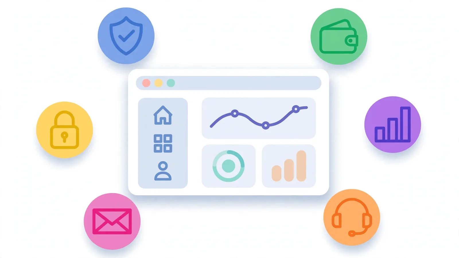
Every menu destination should be labelled. Icons help recognition, but an icon-only rail with no way to reveal the labels forces members to guess.
Look for:
- A visible name beside each main menu icon
- A working expansion control when a compact rail is used
- Icons that render on every item, including Security and Logout
- A layout that does not push account links off the screen
This standard came from repair work on our own packs — the empty square in the opening of this article was one of ours.
5. Plan cards that explain the offer without a second page
Plans themselves are settings in the GoldCoders admin. The template’s job is to display whatever the owner sets—clearly and without breaking when plans are added or removed.
A useful plan card shows:
- Plan name
- Return or rate
- Term
- Minimum and maximum
- Principal treatment
- Compounding information, where applicable
- Payout schedule
Do not judge a template only with ideal sample plans; ask how the cards behave with different names, ranges and plan counts. As our investment-plan design guide says, essential terms belong on the card — not hidden beneath it.
6. A deposit flow that makes the next step unmistakable
The template does not process the deposit — the script and gateway do. The design must still guide the member through method, amount, address and confirmation state without ambiguity.
Look for:
- Supported methods presented clearly
- One consistent set of themed payment-method icons
- Space for a deposit address and, where the flow provides it, a QR code
- A copy control for long wallet addresses
- Clear pending and confirmed states in history
Payment icons deserve attention. A mixed set with different sizes and styles makes the money page look assembled rather than designed. Our packs include a matching themed set because visual disorder on this page creates hesitation.
7. A withdrawal flow that supports review before submission
Withdrawing is a higher-anxiety action than depositing. The template should slow the member down in the right places: available balance, selected method or wallet, amount, and any configured limits or instructions, all clear enough to review before confirming.
Its language should match the actual state — never imply a withdrawal has been paid while it is still processing. Limits and fees come from the script and owner settings; the design just has to present them without confusion.
8. History, account management and security pages
The pages members need when something changes or goes wrong deserve the same design attention.
That includes:
- Deposit, withdrawal and transaction history
- Referral information
- Edit Account
- Password and security settings
- Two-factor or verification prompts where the script presents them
- Support access
Do not confuse presentation with protection: a security page does not secure the server. Password discipline, protected admin access, script settings, hosting controls and backups still have to be configured.
9. Responsive design that is genuinely usable on a phone
“Responsive” should mean more than the page technically becoming narrower. On a phone:
- Text remains readable without pinch-zooming
- No section requires sideways scrolling
- Buttons and menu items are easy to tap
- Plan cards stack in a sensible order
- Long records become readable lists or controlled views
- Deposit addresses and actions remain clear
Test the member pages, not only the homepage. Many members will deposit, check earnings and request withdrawals almost entirely from a phone.
10. Readability, contrast and working interface details
A professional template stays legible under real conditions: headings, labels and figures need contrast, body text comes in short sections, and repeated records need subtle separation so rows do not merge into one another.
Check small controls as carefully as the hero: complete buttons, dropdowns that are not clipped, status messages inside their own section, visible icons. These details rarely headline a feature list, but they separate a pack that photographs well from one that works well.
11. Brand placement and practical customisation
A template should give the platform a coherent place for its name, logo, favicon and brand colours — without forcing a rebuild.
Our Template Customisation service covers colour scheme, logo and favicon placement and basic texts for $15, or a $25 tier adding fonts, homepage rearrangement, key content placement and restyled buttons and plan cards. Ask any seller whether those elements can be changed cleanly, whether colours are controlled consistently, and which changes require a custom project. The structure can be ready-made while the brand and content remain the owner’s.
12. Room for trust content, without fabricated proof
An investment website needs room for what a cautious visitor looks for:
- About, FAQ and rules pages
- Contact and support route
- Clear plan terms
- Platform statistics when the script supplies real values
The design should present facts cleanly, never invent earnings, member totals, payment proof or performance claims. Live-looking statistics are a feature only when connected to real data and labelled accurately.
Our article on design mistakes that make an investment platform look untrustworthy covers the wider pattern: calm presentation, readable terms, consistent payment pages, and a member area given the same care as the homepage.
What our template packs include—and what they do not
Our current packs are listed at $75 in the shop: complete template files, a matching set of themed payment-method icons and a fully responsive layout, with promotional banners in some packs.
A pack does not include:
- The GoldCoders script licence
- Hosting or a domain
- A payment gateway account
- Your investment plans or operating content
- Installation, unless you separately order that service
- Permission to run the same purchased design on a second live platform
One purchase covers one end project; an exclusive pack is sold only once, then marked sold and removed. Visible exclusions are part of the value: a low price that still needs a separate design for every member page is not cheaper than a complete pack.
Features to question before buying from any seller
Ask these questions in writing:
- Can I see every member page, not just the homepage?
- Is the dashboard complete and balanced with sample account data?
- Are payment icons consistent and menu icons visible and labelled?
- How do plan cards handle different numbers and lengths of plans?
- Does the mobile version avoid horizontal scrolling on account pages?
- Which pages are not included?
- Does the design alter any script functionality?
- What is included, what is a service and what remains my responsibility?
- What licence does one purchase cover?
The answers reveal more than a long marketing list of generic words such as “modern”, “premium” and “powerful”.
From our own desk: the homepage is the easiest page to fake
When we test a pack, we install it on a real GoldCoders setup and use it as a member. The failures that matter live inside: a security icon rendered as an empty square, a logout control pushed out of view, a dashboard of plain rows, a cramped plan card, payment icons borrowed from unrelated designs. Judge the working screens and money pages, not the homepage alone.
The bottom line
The features that matter are completeness, clarity and fit: every screen designed as one system; a dashboard centred on the member’s balance; plan cards that explain themselves; deposit and withdrawal flows built for careful review; labelled navigation; consistent payment icons; security and account pages with design attention; and a mobile layout that works without compromise.
Know what the template is not, too: not the script, the gateway, the hosting or the business model. The strongest template makes those systems easier to trust and use — without pretending to replace them.
Frequently asked questions
Does an investment website template include investment plans?
It includes the design used to display plans. The plans themselves—rates, terms, limits and referral levels—are settings the platform owner enters in the GoldCoders admin.
Does the template process deposits and withdrawals?
No. The script and gateway handle transactions and confirmations; the template presents the methods, forms, addresses, states and history clearly.
What is the single most important feature?
A complete member area, especially the dashboard. Members spend most of their time there, and its clarity determines whether the platform feels organised and dependable.
Can missing features be added later?
Plans and content change in the admin, and design elements can be customised. A genuinely new platform function is separate development work — specify and test it first.